

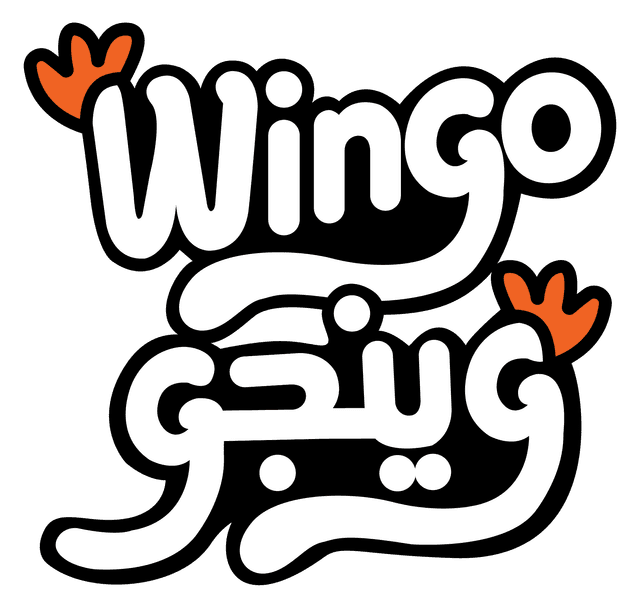
Wingo وينجو
Building a new poultry brand from the ground up.
Overview
Wingo is a poultry and eggs brand built for the Egyptian retail market, covering fresh and frozen whole chicken, chicken cuts, and eggs. With no prior visual equity, Dblshot was engaged to create a complete brand identity from a blank page: name, mascot, color system, packaging architecture, and every operational touchpoint.
The Challenge
- No existing visual identity, name recognition, or packaging system — a true ground-up launch
- A wide, growing product range needing one cohesive visual system
- A commodity category where shelf differentiation and instant trust signals are critical
- An identity that had to scale across uniforms, delivery vehicles, kiosks, and digital
Strategic Foundation: Quality and Care, Worth a Story
The identity was built around warmth and trust rather than a generic poultry mark — reflected in the guiding line “quality and care, for a flavor worth a story.”
Logo Concept
The typography was hand-built on a full geometric construction grid, giving bilingual Arabic/English lockups identical proportions and rhythm — with a chicken-foot flourish woven into the type as an instant category cue.
Mascot Character
A friendly chicken character was developed in two stages: a simple, expressive 2D line illustration for fast applications, and a fully rendered 3D hero version for packaging, the storefront, and delivery-truck livery.
Packaging System
- Eggs — six-egg carton with vitamin callouts, QR traceability code, and full regulatory panel
- Fresh line — whole chicken, drumsticks, and liver with halal-certified, traceable tray labels
- Frozen line — whole chicken, fillet, and cuts with a 9-size weight-range selector and flow-wrap pouches
- Shipping cartons — for eggs and chicken cuts, with full Arabic regulatory copy
Retail & Operational Touchpoints
- Staff uniform — branded vest, cap, polo, lanyard, ID badge, and apron
- Corporate stationery — notebook, letterhead, envelope, business cards, and branded pen
- Delivery system — branded delivery bag, shipping box, motorcycle box, and full truck livery
- Store signage and an in-store retail kiosk concept
Typography
Montserrat serves as the display and body typeface for English copy; Montserrat Arabic carries the same character into Arabic titles and body copy across packaging, signage, and digital.
Outcome
- One unified visual language carried across 65+ brand guideline pages and applications
- A packaging system built to scale across 9+ product lines without fragmenting recognition
- A mascot-driven identity designed to outperform purely typographic competitors on shelf
Color Palette
Let's Talk
Powered by Dblshot — Performance Marketing, E-Commerce & Branding.